You’re getting traffic.
People are visiting your page.
But when it comes to filling out the form… they hesitate and leave.
It’s one of the most common frustrations I hear from founders and marketers.
The good news? Most form drop-offs aren’t because your offer is bad. They’re because of small frictions that make people pause or feel unsure.
Here are the practical changes that actually move the needle.
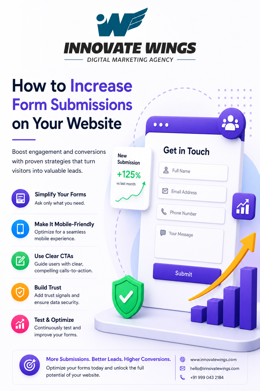
1. Keep the form short and simple
The more fields you ask for, the more people drop off.
Every extra field adds mental work.
What to do:
- Only ask for essential information (usually name, email/phone, and maybe one more detail)
- Use a single-column layout with labels above each field
- Make it easy to complete on mobile
2. Make the next step obvious and appealing
“Submit” is boring and vague.
People want to know exactly what they’re getting.
Better approach:
- Use outcome-based CTAs like “Get My Free Audit”, “Book a 15-min Call”, or “Send Me the Checklist”
- Add a short benefit statement right above the form
Example:
“Get a free strategy call in 24 hours. We’ll review your request and get back to you fast. No spam, no pressure.”
3. Build trust right next to the form
People hesitate when they don’t feel safe giving their information.
Simple trust boosters:
- Add 1–2 real testimonials or case studies nearby
- Show security badges or privacy notes (“We respect your inbox”)
- Include a real photo or name if it fits your brand
4. Place the form where intent is already high
Don’t hide the form at the bottom of a long page.
Good placements:
- Above the fold on key landing pages
- At the end of a helpful blog post
- In pop-ups after someone has read 50% of valuable content
5. Make the experience smooth on mobile
A huge chunk of traffic is on phones.
If the form feels slow or clunky, people leave.
Quick checks:
- Test the form yourself on your phone
- Enable autofill
- Make error messages clear and helpful
A simple formula that works well
Benefit statement + short form + trust signal + clear CTA.
Example:
“Get a free audit in 24 hours”
[Short form: Name, Email, Website]
“No spam, ever”
“Get My Audit”
Fast wins you can do this week
1. Cut 1–2 unnecessary fields
2. Rewrite the headline to clearly explain the value
3. Add one real testimonial or case study beside the form
4. Change the CTA to an outcome-based button
5. Test the entire form on mobile
6. Check where people drop off and remove the worst field
Small changes like these often lift form submissions by 30–80% without changing your offer.
Innovate Wings — your business growth strategy agency — helps businesses improve conversion rates through clearer messaging, better forms, and stronger trust signals.
If your forms aren’t converting well and you want honest feedback, drop “FORMS” below or DM your page link.
We’ll take a quick look and point out the biggest opportunities — no sales pitch, just real talk.
We boost sales and build a strong lead funnel with digital growth strategies. Using platforms like Facebook, Instagram, LinkedIn & Google Ads to build recurring leads and sales.